| Modifying IssueNet Forms |
| Document ID: Q000046 |
| Last Revised On: Thursday, December 15, 2005 |
| |
| This article applies to the following: |
| Component(s): |
| Architect |
| |
| Solutions(s): |
| All |
| |
|
The IssueNet Architect provides a forms designer, which allows the IssueNet administrator to modify existing forms, or create new forms.
|
| |
|
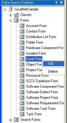
IssueNet Object Forms (e.g., Issues, Tasks, Folders, etc.) can be modified in the IssueNet Architect’s Forms Designer. To edit an existing form, launch the Architect and select the form that you wish to modify from the Data Source Explorer.
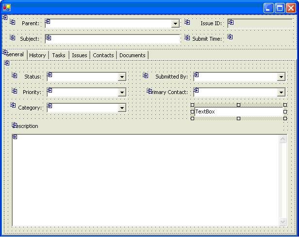
With the form now open, select the Layout tab to view the current layout of the fields on the form. The Layout tab in the IssueNet form designer provides a WYSIWYG environment for designing the appearance of forms as well as the class property loaded by each control. This section is designed to help you master the fundamentals of IssueNet designing form layouts.
The three basic design tools are:
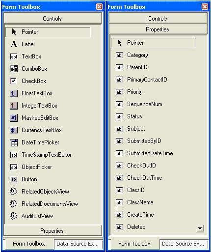
- The Form Toolbox which lists the controls IssueNet provides for form design. To add a control to a form, drag and drop the control from the list onto the region of the form.
- The Layout Tab which allows you to select a form element you want to edit, allows you to re-size form elements, and allows you to position elements on the form.
- The Form Properties Pane which allows you to set the properties for the selected form element in the layout tab.
|
| |
|
When designing a from layout there are several control properties and best practices that can greatly simplify the form design process, prevent simple mistakes, and allow you to take full advantage of the of the features of the forms designer ? particularly if you are not an experienced user of a standard forms design environment. The purpose of this section is to familiarize you with the most common and useful form design features and best practices you should keep in mind as you create and modify forms, including:
- Using Controls for Large Text Fields
- Setting Default Values
- Setting the Empty Item Property
- Setting the Drop Down Style in Comboboxes
- Setting the Anchor Property
- Setting Useful Control Names
A comprehensive discussion of all the available form and control properties is beyond the scope of this help file. However, because the IssueNet form layout environment is based on the form layout environment used in Visual Studio .NET, the Visual Studio documentation can serve as an additional reference and guide for many tools and techniques available in the IssueNet layout environment.
|
| |
|
There are two controls that can be used for text entries that exceed a single line. For simple text entry fields the Text Box control can be used with the Multiline property set to true. However, the Text Box control does not offer options for time stamps, protected text, and does not produce a scroll bar for entries that exceed the size of the control ? users must use the keyboard or mouse within the box to scroll.
For the options to use timestamps and protected text as well as a scroll bar, use the TimeStampTextEditor control. By setting the TimeStampTemplate property to a value such as the default; "FROM: $(CurrentContactID->FormattedName) DATE: $(LocalNow) $(LocalTimeZone)" and setting the TimeStampEnabled property to true, you can have a time stamp in this format placed before all text entries. By setting the ProtectedTextEnabled option to true, the control will convert to a split control where the bottom half allows new entries to be added and the top half displays previous entries in a read only format.
|
| |
|
Most controls allow setting a default value by setting a Text or EditText property. Although this is a useful method for setting default values for each form, it is often more useful to set a default value by editing the default value property of the class property the control will be bound to. Setting default values on the class property as opposed to the form, ensures that all forms that have that property will always have the same default value and reduce maintenance when class properties change. However, if setting a default value for a specific form is desired, the Text and EditText properties may be the correct choice.
|
| |
|
In some instances it is useful to provide a combo box which allows the user to set the value to nothing. For example, if a field for issue Severity is optional it makes sense to allow a user to set the value to nothing even if a value has been previously selected. Similarly, if you are adding a combo to a search form you always want to allow the user to set a pervious selected value to nothing in order to wider their search criteria. To allow a combo box to be set to nothing, set the IncludeEmptyItem property to true and set any desired text as the empty item label in the EmptyItemName property.
|
| |
|
In some instances it is useful to provide a combo box which provides a user with a list of choices but also allows them to enter their own text in the control. Enable a combo box control for this type of use, set the DropDownStyle property of the ComboBox control to DropDown from the default value DropDownList.
|
| |
|
If a control added to a form does not maintain the desired position, particularly when the form is re-sized, try adjusting the Anchor property of the control. This property and the Docking property control how a control resizes itself and moves on the form. There are many different way to set these properties. However, a good guide is to select an existing control on the form and copy those settings.
|
| |
|
When designing a form is it useful to change the default name property to a value that will allow you to easily identify the control. For example, when adding combo box for a property named "Frequency" change the default control name of "ComboBox" to something like "cbFrequency". Intuitive control names make form scripts much easier to create and maintain since it is the control name which allow you identify it in the script and the script editor fields which help you pick controls and control properties.
|
| |
|
There many different controls you can add to a form and even more properties of a form and its controls you can edit in the form designer. However, the most common operation is adding a control to a form and binding the control to a class property to make that property available to users when they use the form.as Issue Status, you will want to select a combo box control.
The first step is to drag the correct type of control onto the form by selecting the control in the Form Toolbox and dragging it onto the form layout to the location you want it to have. You will want to select the control type based on the type of property you want to bind the control to. For example, if the property you intend to bind the control to is a string you will want to select a text box control, time stamp text editor control, or a masked edit control. If the property is linked to an item list such as Issue Status, you will want to select a combo box control.
Once you have added the control to the form you can begin to edit its properties in the Form Properties pane. The most important property you will want to set is the Member Name property in Form Properties pane. This property determines which class property the control is bound to. The available class properties are based on the class the form is bound to in the Class Binding field of the General tab. Once you have added a control and set the member name, users will be able see the control and view and set the value of the property when they load the form.
Keep in mind that some controls featured in the Form Tool box are not bound to a class property. The Button control, for example, is designed to be used in conjunction with forms scripts and is never associated with a class property.
|
| |
| |